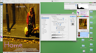
Now I have finished editing my poster for "Home". There are a few things I wanted to analyse from the designing and editing process. After elaborating my ideas I designed the ideal poster that I wanted for "Home". I decided on going with the idea of the girl positioned at the side of the picture, and having an empty background to emphasize her lonliness. I took many different pictures so I had a variety to choose from whilst editing. The one that I chose had her looking slightly to the side with an expression of sadness and fear, she was holding her bag and her iconic teddy bear that was featured in the trailer, this creates some synergy between the two. After uploading the pictures on to the computer, I opened Photoshop and there the editing begun! At first I found it a challenge to get to grips with Photoshop as I have only used it once briefly before, but after a few days of playing around with the effects it got easier and I began to understand it. Here is a snap shot of my poster whilst I was editing it in Photoshop:

I started off by selecting her so I could put a different effect on her to the background. I wanted to create this effect so I could make her stand out and blur the background slightly. To do this I brought out the colours in her so it drew more attention and I used an effect on the background which allowed me to slightly blur the selected part of the image. Although I blurred the background, it still played a big part in my poster. This is why I left it as blank as I could next to her, so the poster showed her alone in an empty setting and lost in emotion.
Then after editing the photo I started thinking about titles and credits. I wanted to create some more synergy with the trailer and the poster, so I decided to use the same font and colour of the title: "Home". I feel that this connected the two together and became recogniseable for the my potential target audience. Then I added in my tagline in a different colour to differentiate it from the title of the film. Following I added the credits. At the top of the poster I put the name of the actress who plays the main character: Lily Hewitt. I had this in the colour white and faded it slightly. My film doesn't have star power, therefore it focuses on genre, so I didn't want to draw too much attention to the name, but I still wanted to include it.
Finally I added the credits at the bottom of the poster. Most posters have this, it's usually in small print and has a few lines written about who directed the film, who produced the film, who the music was by, etc. Then some of them have the release date included in that text, this is what I chose to do. I liked this idea and when using it in my poster I wrote it in white so it also didn't draw too much attention and then at the end of the text I wrote: "SUMMER 2011" in black so it stands out to the audience, to make them aware of the release date.


