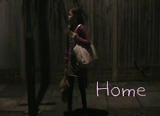
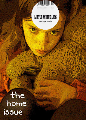
The main thing that plays a big part in my teaser trailer, poster and magazine cover is the main character: Evie Becks. She was the main focus of my teaser trailer, so the audience saw her many times and may have began to recognize what she looks like and become familiar with the character she is playing. As a result, when the audience would have seen her again elsewhere, they would be able to acknowledge that she is “the girl from “Home””, as they may say. So when making my poster and magazine cover, I again focused on her so the audience would be able to notice and match her up with the trailer. My poster features her standing at the side on a street, looking scared, sad and alone. This is very similar to how her character was portrayed in the trailer. Therefore, when the audience saw her again positioned like this in the poster, they would most likely be able recognize her. I felt that this was effective and can create awareness of the film and captures the target audience. I also did this for the magazine cover. It features a close up of her face, which again helps the audience identify her and realize that the film is coming out soon.

Evies teddy bear is a very important prop and represents how young she is, her vulnerability and her innocence. She was shown in the trailer in many of the scenes holding the teddy bear and running with the teddy bear. She uses it so it’s almost her protection and her comfort from what’s happening. In the second to last shot of the trailer there is also a short close up of her hand holding the teddy bear, this again emphasizes her age and shows that her teddy bear is very important to her. Taking all of this into account, to create synergy between my teaser trailer, poster and magazine cover, I had the teddy bear in each one of them. In my poster, I had her holding the teddy bear in one of her hands, she is also seen in the trailer running with the teddy bear whilst holding it this same way. This then helps the audience connect the teaser trailer and the poster together, because they can see the significance of the teddy bear and what it means to her. In my magazine cover, I had her hugging the teddy bear whilst looking at the camera. The audience can only see the back of it but because of the editing, I have made it stand out, the effect I used has helped the audience easily spot that it’s her teddy bear. This connection was the most effective for me because it that plays a very important part of her identity and I was able to strongly represent this in each one of my products.

Back when editing my teaser trailer, when I was deciding what font to use, I wanted a font that was quite childlike so it would fit with the main character and the storyline. After searching through hundreds of different fonts, I found the perfect one which was called: Kaileen. It was ideal; it was very soft and gave a childlike feeling to it, which was exactly what I wanted. However, I wasn’t sure if this would be as effective and easy to recreate as I had thought, because I thought that by using the same font for each might make it a bit repetitive and make each product look too similar and not individual enough. But I did continue to use the same font and see how it turned out. Therefore, in my teaser trailer, at the end is where the title of the film, when it is going to be released and the website appears, all of this is done in the Kaileen font and in a very light pink colour. Followed by my poster, I used the same font and colour for the title to relate each piece of my work together. However, I used a different font and colour for the rest of the writing. I did this because I wanted “Home” to stand out from everything else, so it is the first thing that the audience see and notice. Then, for my magazine cover, I also used the same font to as well connect the teaser trailer, poster and magazine cover together. Although I wasn’t sure if these links would work, I was actually quite happy with how it turned out and I feel that it was somewhat effective. I managed to differentiate each of my products but also continue to create a strong and an overall effective synergy between them.


No comments:
Post a Comment