Tuesday, 30 November 2010

Designing and editing my poster

Now I have finished editing my poster for "Home". There are a few things I wanted to analyse from the designing and editing process. After elaborating my ideas I designed the ideal poster that I wanted for "Home". I decided on going with the idea of the girl positioned at the side of the picture, and having an empty background to emphasize her lonliness. I took many different pictures so I had a variety to choose from whilst editing. The one that I chose had her looking slightly to the side with an expression of sadness and fear, she was holding her bag and her iconic teddy bear that was featured in the trailer, this creates some synergy between the two. After uploading the pictures on to the computer, I opened Photoshop and there the editing begun! At first I found it a challenge to get to grips with Photoshop as I have only used it once briefly before, but after a few days of playing around with the effects it got easier and I began to understand it. Here is a snap shot of my poster whilst I was editing it in Photoshop:


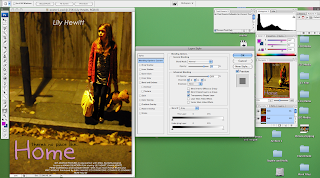
I started off by selecting her so I could put a different effect on her to the background. I wanted to create this effect so I could make her stand out and blur the background slightly. To do this I brought out the colours in her so it drew more attention and I used an effect on the background which allowed me to slightly blur the selected part of the image. Although I blurred the background, it still played a big part in my poster. This is why I left it as blank as I could next to her, so the poster showed her alone in an empty setting and lost in emotion.

Then after editing the photo I started thinking about titles and credits. I wanted to create some more synergy with the trailer and the poster, so I decided to use the same font and colour of the title: "Home". I feel that this connected the two together and became recogniseable for the my potential target audience. Then I added in my tagline in a different colour to differentiate it from the title of the film. Following I added the credits. At the top of the poster I put the name of the actress who plays the main character: Lily Hewitt. I had this in the colour white and faded it slightly. My film doesn't have star power, therefore it focuses on genre, so I didn't want to draw too much attention to the name, but I still wanted to include it.

Finally I added the credits at the bottom of the poster. Most posters have this, it's usually in small print and has a few lines written about who directed the film, who produced the film, who the music was by, etc. Then some of them have the release date included in that text, this is what I chose to do. I liked this idea and when using it in my poster I wrote it in white so it also didn't draw too much attention and then at the end of the text I wrote: "SUMMER 2011" in black so it stands out to the audience, to make them aware of the release date.

Tuesday, 23 November 2010

Shooting session for poster

This is the picture that I chose for my poster:

I chose this picture because I liked the way you can see a slight fear in her eyes and the way that the background is empty, giving the feeling of loneliness. I also liked the slight glow the image gave, I think that it brought it to life.

These are some other pictures I took during the filming session, I was experimenting a few different shots to see which one would fit best to my film:


In the first picture I used flash on my camera and I didn't think that it gave it a good effect. Although I wanted the picture to be dark and empty, with the flash I thought that it looked too dull and simple, so I decided to take some of the pictures without the flash to try and get the right effect. I also didn't use this picture because I wanted her placed at the side of the image, I was just trying lots of different things to have a variety to chose from.

The second picture of the teddy bear was just a test to see how it looked, I had the idea of how I wanted my poster to look pretty clear but I just thought I would take a risk and take a picture of just the teddy bear to see if it was effective, and I found that it wasn't effective enough as I had thought. Although the teddy bear is an important and iconic prop in my film, I didn't think that it was enough to have just that on the poster.

The third picture of the girl in her room with her teddy bear and bag did not go to plan as you can see! This one came out a bit blurry, the others were ok but I wasn't satisfied with how it looked, I didn't think it looked 'real' enough and didn't create the feeling that I wanted for poster.

Overall, this shooting session for my poster went really well. I am glad that I took a variety of different pictures because it gave me the opportunity to experiment with a few of them whilst editing and then decide which one worked best with my film.

Monday, 22 November 2010

Tagline for my poster

I found it quite hard trying to think of a tagline for my poster for "Home". On most film posters there is a tagline which usually sends out a message about the film, but doesn't give much away. So it keeps the audience in suspense and they are intrigued to find out what it's about and what's going to happen. I looked back at my trailer and poster influences for "Home" and got some ideas from there and then created my own tagline. I really liked the tagline for "Precious", it's effective and fits perfectly to the genre of the film. It says: "the longest journey begins with a single step". This message is similar to the message that I want to portray. I was thinking of something like "a journey she'll never forget", but still wasn't too sure if it worked enough as I wanted it to. So I thought of doing something like "behind closed doors, everythings not what it seemed". But I still wasn't too sure whether it worked or not, it didn't quite give the emotion that I wanted and I also wanted to include something that relates directly to the title: "Home". So after careful consideration, I came up with an idea for my tagline: "theres no place like home". I think it fits well and accompanies the trailer. It also leaves the door open for the audience to explore; meaning that it doesn't give too much away and leaves them to wonder what could happen in the film.

Wednesday, 17 November 2010

Influences for my poster


Ideas for my poster

Now my teaser trailer: "Home" is complete, we are currently making a poster for it. I have a few ideas in mind of what I would like my poster to look like. I want it to focus on just the young girl and emphasise her loneliness and sadness. Therefore I thought of doing a picture where the girl is alone on the street, similar to the final scene of my teaser trailer. Maybe having her slightly more to one side of the shot to show the empty street beside her and her alone with just herself and her teddy bear - iconic (important prop used a lot in the trailer to highlight her childhood). Here is a rough sketch of some ideas for my poster:


Thursday, 11 November 2010

In reflection..

Now I have finished my teaser trailer: "Home", there are a few things that I wanted to mention; a few things that I came across during filming my trailer. The first is working with children. Whilst planning and filming my trailer, I had to take in to consideration that my main character is a child. Children have a short attention span and when in high pressured situations they have to have regular breaks to keep them on the ball and focused. So I took a risk by casting a child for the main character in my trailer, but it was a risk that I am proud of as I think it worked really well. I didn't encounter any major problems related to this during filming, but there were a few things that made me realise what its like to work with children in comparison to adults. For example; Lily (who plays Evie Becks in my trailer), is 9 years old, she played the part extremely well and I was really pleased with her performance. But because she is young, there were times whilst we were filming where she couldn't stop laughing and it took her many shots to get in to the role, I suppose this is because she is young and didn't really take the situation that seriously, because for her it was probably quite boring. Also, the filming process took longer than I thought because when filming with a child, she had to have regular breaks because if we went on for too long then she would get distressed, lose interest and not put as much effort in to the scene as before. Although I must say that overall when she got in to the character, she played her really well and fulfilled the expectations that I had of Evie Becks, I am very thankful.

Another thing that I came across was the problem of the weather. For my first shot of the mother and daughter in a home video effect, I wanted it to be outside so it looked bright and happy. But due to the weather, this wasn't possible as it was cold and quite dark. So as an alternative I decided to move inside and create a warm and cosy feeling there. Although it wasn't my first choice; I am still very happy with the way it turned out. It also worked well because there are a few scenes after this shot in the trailer of that same room but the atmosphere has changed; this gives it a contrast from what it was before to what it is now.

Overall, I am pleased with my teaser trailer and I feel that I have achieved my goals and hope to do so in making the poster and magazine cover for "Home".

My teaser trailer: "Home"