Niamhs Media Studies Coursework A2
Tuesday, 25 January 2011
2) How effective is the combination of your main products and ancillary texts?
The combination between media products and ancillary texts is usually known as synergy. In terms of media, synergy is the promotion and sale of a product (and all its versions) throughout the various subsidiaries of a media conglomerate, e.g. films, soundtracks or video games. These products can help advertise the film itself and help to increase its sales. Therefore, in terms of my products, I have connected my teaser trailer, poster and magazine cover together and I believe that it is strongly effective and helps capture my target audience.
The main thing that plays a big part in my teaser trailer, poster and magazine cover is the main character: Evie Becks. She was the main focus of my teaser trailer, so the audience saw her many times and may have began to recognize what she looks like and become familiar with the character she is playing. As a result, when the audience would have seen her again elsewhere, they would be able to acknowledge that she is “the girl from “Home””, as they may say. So when making my poster and magazine cover, I again focused on her so the audience would be able to notice and match her up with the trailer. My poster features her standing at the side on a street, looking scared, sad and alone. This is very similar to how her character was portrayed in the trailer. Therefore, when the audience saw her again positioned like this in the poster, they would most likely be able recognize her. I felt that this was effective and can create awareness of the film and captures the target audience. I also did this for the magazine cover. It features a close up of her face, which again helps the audience identify her and realize that the film is coming out soon.
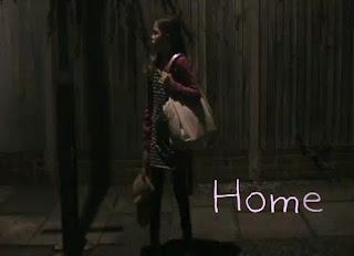
Evies teddy bear is a very important prop and represents how young she is, her vulnerability and her innocence. She was shown in the trailer in many of the scenes holding the teddy bear and running with the teddy bear. She uses it so it’s almost her protection and her comfort from what’s happening. In the second to last shot of the trailer there is also a short close up of her hand holding the teddy bear, this again emphasizes her age and shows that her teddy bear is very important to her. Taking all of this into account, to create synergy between my teaser trailer, poster and magazine cover, I had the teddy bear in each one of them. In my poster, I had her holding the teddy bear in one of her hands, she is also seen in the trailer running with the teddy bear whilst holding it this same way. This then helps the audience connect the teaser trailer and the poster together, because they can see the significance of the teddy bear and what it means to her. In my magazine cover, I had her hugging the teddy bear whilst looking at the camera. The audience can only see the back of it but because of the editing, I have made it stand out, the effect I used has helped the audience easily spot that it’s her teddy bear. This connection was the most effective for me because it that plays a very important part of her identity and I was able to strongly represent this in each one of my products.

Back when editing my teaser trailer, when I was deciding what font to use, I wanted a font that was quite childlike so it would fit with the main character and the storyline. After searching through hundreds of different fonts, I found the perfect one which was called: Kaileen. It was ideal; it was very soft and gave a childlike feeling to it, which was exactly what I wanted. However, I wasn’t sure if this would be as effective and easy to recreate as I had thought, because I thought that by using the same font for each might make it a bit repetitive and make each product look too similar and not individual enough. But I did continue to use the same font and see how it turned out. Therefore, in my teaser trailer, at the end is where the title of the film, when it is going to be released and the website appears, all of this is done in the Kaileen font and in a very light pink colour. Followed by my poster, I used the same font and colour for the title to relate each piece of my work together. However, I used a different font and colour for the rest of the writing. I did this because I wanted “Home” to stand out from everything else, so it is the first thing that the audience see and notice. Then, for my magazine cover, I also used the same font to as well connect the teaser trailer, poster and magazine cover together. Although I wasn’t sure if these links would work, I was actually quite happy with how it turned out and I feel that it was somewhat effective. I managed to differentiate each of my products but also continue to create a strong and an overall effective synergy between them.

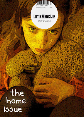
The main thing that plays a big part in my teaser trailer, poster and magazine cover is the main character: Evie Becks. She was the main focus of my teaser trailer, so the audience saw her many times and may have began to recognize what she looks like and become familiar with the character she is playing. As a result, when the audience would have seen her again elsewhere, they would be able to acknowledge that she is “the girl from “Home””, as they may say. So when making my poster and magazine cover, I again focused on her so the audience would be able to notice and match her up with the trailer. My poster features her standing at the side on a street, looking scared, sad and alone. This is very similar to how her character was portrayed in the trailer. Therefore, when the audience saw her again positioned like this in the poster, they would most likely be able recognize her. I felt that this was effective and can create awareness of the film and captures the target audience. I also did this for the magazine cover. It features a close up of her face, which again helps the audience identify her and realize that the film is coming out soon.

Evies teddy bear is a very important prop and represents how young she is, her vulnerability and her innocence. She was shown in the trailer in many of the scenes holding the teddy bear and running with the teddy bear. She uses it so it’s almost her protection and her comfort from what’s happening. In the second to last shot of the trailer there is also a short close up of her hand holding the teddy bear, this again emphasizes her age and shows that her teddy bear is very important to her. Taking all of this into account, to create synergy between my teaser trailer, poster and magazine cover, I had the teddy bear in each one of them. In my poster, I had her holding the teddy bear in one of her hands, she is also seen in the trailer running with the teddy bear whilst holding it this same way. This then helps the audience connect the teaser trailer and the poster together, because they can see the significance of the teddy bear and what it means to her. In my magazine cover, I had her hugging the teddy bear whilst looking at the camera. The audience can only see the back of it but because of the editing, I have made it stand out, the effect I used has helped the audience easily spot that it’s her teddy bear. This connection was the most effective for me because it that plays a very important part of her identity and I was able to strongly represent this in each one of my products.

Back when editing my teaser trailer, when I was deciding what font to use, I wanted a font that was quite childlike so it would fit with the main character and the storyline. After searching through hundreds of different fonts, I found the perfect one which was called: Kaileen. It was ideal; it was very soft and gave a childlike feeling to it, which was exactly what I wanted. However, I wasn’t sure if this would be as effective and easy to recreate as I had thought, because I thought that by using the same font for each might make it a bit repetitive and make each product look too similar and not individual enough. But I did continue to use the same font and see how it turned out. Therefore, in my teaser trailer, at the end is where the title of the film, when it is going to be released and the website appears, all of this is done in the Kaileen font and in a very light pink colour. Followed by my poster, I used the same font and colour for the title to relate each piece of my work together. However, I used a different font and colour for the rest of the writing. I did this because I wanted “Home” to stand out from everything else, so it is the first thing that the audience see and notice. Then, for my magazine cover, I also used the same font to as well connect the teaser trailer, poster and magazine cover together. Although I wasn’t sure if these links would work, I was actually quite happy with how it turned out and I feel that it was somewhat effective. I managed to differentiate each of my products but also continue to create a strong and an overall effective synergy between them.


Tuesday, 4 January 2011
Ideas for my evaluation
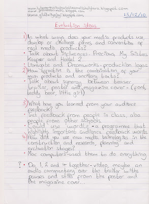
Here are some rough notes that I made to give me some ideas and prepare myself for the evaluation. I just wrote down the questions and the main things that I wanted to talk about in each one. Whilst making these notes I wasn't entirely sure how I was going to present my evaluation, but now I have more of an idea. I am going to answer each question in form of a video, using lots of stills from my teaser trailer, screen shots, images and an audio commentary over it answering the questions in detail, matching what will be shown on the video. I am going to answer all of the questions in this way but split each video up, so I have 4 different videos on my blog. This is so it makes it easier to look at each question without having to scroll through just one video to find a question.
The questions that we have to answer are:
1) In what ways does your media product use, develop or challenge forms and conventions of real media products?
The questions that we have to answer are:
1) In what ways does your media product use, develop or challenge forms and conventions of real media products?
2) How effective is the combination of your main products and ancillary texts?
3) What have you learned from your audience feedback?
4) How did you use new media technologies in the construction and research, planning and evaluation stages?

Tuesday, 14 December 2010
Monday, 13 December 2010
Designing and editing my magazine cover
Now I have finished editing my magazine cover for "Home". There are a few things I wanted to analyse from the designing and editing process. After elaborating my ideas I designed the ideal magazine cover that I wanted for "Home". I decided on going with the idea of a close up of the girl with her teddy bear and the "Little White Lies" logo at the top. I took many different pictures so I had a variety to choose from whilst editing. The one that I chose had her looking at the camera whilst she was hugging her teddy bear. By using the teddy bear again it created synergy between my three pieces of work, this helps audiences relate each thing and remember the film. After uploading the pictures on to the computer, I opened Photoshop and there the editing begun! Now I know my way around Photoshop, I found it a bit easier to edit the magazine cover. Here is a snap shot of my poster whilst I was editing it in Photoshop:
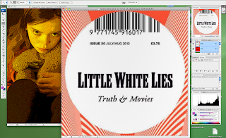
I started off by cropping the image to make it portrait. When I took my picture it was landscape, and magazine covers are usually portrait, so I cropped my magazine cover, it also made it look more real. Then I played around with all the different effects that Photoshop has. I wanted to find an effect that was similar to the effects that the "Little White Lies" magazine covers use. So I chose an effect called: "poster edges" that made my picture look animated and stayed true to the design of the magazine cover. I then played around with the lighting and adjusted it so that around her was quite dark but her face and the teddy bear was lighter, I did those so she would stand out.
After, I went on to google images and found the "Little White Lies" film magazine cover logo, then I did a print screen of it and opened it in Photoshop. Following, I used the selection tool and selected only the "Little White Lies" logo, then I right clicked the selection; copied; and then pasted it on top of the other image of the girl. This then gave me the logo as a layer on top of my magazine cover and allowed me to move it around a resize it to what I wanted. All of the "Little White Lies" logos are placed at the top of the cover and in the middle, usually on top of the head of the character (if there is one), so I stuck to this and did the same for my magazine cover. Although, I had a bit of trouble during this process because the logo covered a bit too much of her head, so I had to adjust the image and move it down so the logo covered the right amount of her head. To finish of the logo of "Little White Lies", I then changed the date to 2011, so it looked and felt more realistic.
Finally, I added the title of the film. Most of the "Little White Lies" magazine covers have the name of the film and then "issue" after it. For example: "The Where The Wild Things Are Issue" or "The An Education Issue". So following this, I had on my magazine cover: "The Home Issue". I had it in the colour white because I thought that it looked better because it matched with the "Little White Lies" logo. It also helped it stand out, but I wanted the word "Home" to stand out more because its the title of the film. Therefore, I used an effect called "outer glow" on the word: "Home" to emphasise and draw attention to it. I also used the same font that I used for the poster and the trailer, again; I felt that this created synergy and connected the three together for the audience.
Subscribe to:
Comments (Atom)
