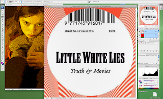
Now I have finished editing my magazine cover for "Home". There are a few things I wanted to analyse from the designing and editing process. After elaborating my ideas I designed the ideal magazine cover that I wanted for "Home". I decided on going with the idea of a close up of the girl with her teddy bear and the "Little White Lies" logo at the top. I took many different pictures so I had a variety to choose from whilst editing. The one that I chose had her looking at the camera whilst she was hugging her teddy bear. By using the teddy bear again it created synergy between my three pieces of work, this helps audiences relate each thing and remember the film. After uploading the pictures on to the computer, I opened Photoshop and there the editing begun! Now I know my way around Photoshop, I found it a bit easier to edit the magazine cover. Here is a snap shot of my poster whilst I was editing it in Photoshop:

I started off by cropping the image to make it portrait. When I took my picture it was landscape, and magazine covers are usually portrait, so I cropped my magazine cover, it also made it look more real. Then I played around with all the different effects that Photoshop has. I wanted to find an effect that was similar to the effects that the "Little White Lies" magazine covers use. So I chose an effect called: "poster edges" that made my picture look animated and stayed true to the design of the magazine cover. I then played around with the lighting and adjusted it so that around her was quite dark but her face and the teddy bear was lighter, I did those so she would stand out.
After, I went on to google images and found the "Little White Lies" film magazine cover logo, then I did a print screen of it and opened it in Photoshop. Following, I used the selection tool and selected only the "Little White Lies" logo, then I right clicked the selection; copied; and then pasted it on top of the other image of the girl. This then gave me the logo as a layer on top of my magazine cover and allowed me to move it around a resize it to what I wanted. All of the "Little White Lies" logos are placed at the top of the cover and in the middle, usually on top of the head of the character (if there is one), so I stuck to this and did the same for my magazine cover. Although, I had a bit of trouble during this process because the logo covered a bit too much of her head, so I had to adjust the image and move it down so the logo covered the right amount of her head. To finish of the logo of "Little White Lies", I then changed the date to 2011, so it looked and felt more realistic.
Finally, I added the title of the film. Most of the "Little White Lies" magazine covers have the name of the film and then "issue" after it. For example: "The Where The Wild Things Are Issue" or "The An Education Issue". So following this, I had on my magazine cover: "The Home Issue". I had it in the colour white because I thought that it looked better because it matched with the "Little White Lies" logo. It also helped it stand out, but I wanted the word "Home" to stand out more because its the title of the film. Therefore, I used an effect called "outer glow" on the word: "Home" to emphasise and draw attention to it. I also used the same font that I used for the poster and the trailer, again; I felt that this created synergy and connected the three together for the audience.
No comments:
Post a Comment