
Tuesday, 14 December 2010
Monday, 13 December 2010
Designing and editing my magazine cover
Now I have finished editing my magazine cover for "Home". There are a few things I wanted to analyse from the designing and editing process. After elaborating my ideas I designed the ideal magazine cover that I wanted for "Home". I decided on going with the idea of a close up of the girl with her teddy bear and the "Little White Lies" logo at the top. I took many different pictures so I had a variety to choose from whilst editing. The one that I chose had her looking at the camera whilst she was hugging her teddy bear. By using the teddy bear again it created synergy between my three pieces of work, this helps audiences relate each thing and remember the film. After uploading the pictures on to the computer, I opened Photoshop and there the editing begun! Now I know my way around Photoshop, I found it a bit easier to edit the magazine cover. Here is a snap shot of my poster whilst I was editing it in Photoshop:
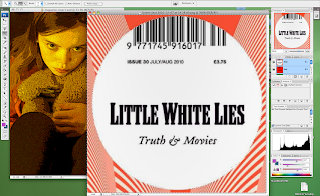
I started off by cropping the image to make it portrait. When I took my picture it was landscape, and magazine covers are usually portrait, so I cropped my magazine cover, it also made it look more real. Then I played around with all the different effects that Photoshop has. I wanted to find an effect that was similar to the effects that the "Little White Lies" magazine covers use. So I chose an effect called: "poster edges" that made my picture look animated and stayed true to the design of the magazine cover. I then played around with the lighting and adjusted it so that around her was quite dark but her face and the teddy bear was lighter, I did those so she would stand out.
After, I went on to google images and found the "Little White Lies" film magazine cover logo, then I did a print screen of it and opened it in Photoshop. Following, I used the selection tool and selected only the "Little White Lies" logo, then I right clicked the selection; copied; and then pasted it on top of the other image of the girl. This then gave me the logo as a layer on top of my magazine cover and allowed me to move it around a resize it to what I wanted. All of the "Little White Lies" logos are placed at the top of the cover and in the middle, usually on top of the head of the character (if there is one), so I stuck to this and did the same for my magazine cover. Although, I had a bit of trouble during this process because the logo covered a bit too much of her head, so I had to adjust the image and move it down so the logo covered the right amount of her head. To finish of the logo of "Little White Lies", I then changed the date to 2011, so it looked and felt more realistic.
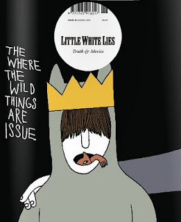
Finally, I added the title of the film. Most of the "Little White Lies" magazine covers have the name of the film and then "issue" after it. For example: "The Where The Wild Things Are Issue" or "The An Education Issue". So following this, I had on my magazine cover: "The Home Issue". I had it in the colour white because I thought that it looked better because it matched with the "Little White Lies" logo. It also helped it stand out, but I wanted the word "Home" to stand out more because its the title of the film. Therefore, I used an effect called "outer glow" on the word: "Home" to emphasise and draw attention to it. I also used the same font that I used for the poster and the trailer, again; I felt that this created synergy and connected the three together for the audience.
Shooting session for magazine cover
Here is the picture that I chose for my magazine cover:

I chose this picture because I like the way that she is holding on to teddy bear, it shows her vulnerability and how young she is. I also like the way that she's looking and posing for the camera but in costume of her character, this is what most magazine covers do. It lets the audience feel involved with the film, they feel like the actor is looking at them and advertising is targeted at them.
Here are some other pictures that I took during the shooting session for my magazine cover, I wanted a choice of different pictures so I had flexibility whilst editing:


In the first picture, I had the girl looking at the camera with her teddy bear and her bag, two things from the teaser trailer and the poster. But I didn't feel that it worked for my magazine cover. I think that it looked far too similar to my poster and therefore I decided not to use it, I wanted something that had synergy to the poster and the trailer but that was also individual and had its own design.
In the second picture, I had the girl with her teddy bear from a side angle, this is similar to the picture that I chose for my magazine cover. I tried it from a few different angles and I liked them all but I felt that the one I chose looked best and fitted better with "Little White Lies"
Finally, in the third picture, I had a similar position to the first picture: the girl with her teddy bear and bag, outside her front door. But she wasn't looking at the camera for this one and so I felt that it didn't look like a magazine cover. Also, I feel that it didn't feel professional and real enough for "Little White Lies".
Overall, I feel that our final shooting session for "Home" went really well, I was really pleased with the pictures that I took. I am glad that I experimented with different shots and angles, it gave the opportunity to play around with lots of different effects and covers whilst editing.
Influences for my magazine cover
The difference between the poster and the magazine cover is that the poster shows what the film is going to be like and gives away its genre so audiences know what to expect. Then a magazine cover usually shows the main character of the film in costume but deliberately posing and looking at the camera, then inside the magazine there are usually shots from the film, interviews with the characters, etc.
Although, there are some similarities between the poster and the magazine cover. Therefore, when designing my magazine cover, it was quite a smooth process as I had my poster to influence me, as well as my teaser trailer.
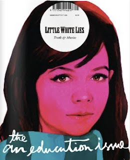
The idea for the front of my magazine cover is a close up of the young girl with the teddy bear, so I wanted to use an existing film magazine that would fit with my idea. At first I considered creating my own magazine, but I struggled on thinking of a good name and design for it, I couldn't find anything that sounded believable and fitted with "Home". So I looked at a few existing film magazines to try and find and some influences and then decided which one I wanted to use. I looked at magazines such as "Empire", "Entertainment" and "Total Film". But the majority of them seemed to be advertising big blockbuster films, specifically action, and I felt that my film "Home" didn't fit with this because it's a family drama about a young girl. Then I came across the film magazine: "Little White Lies". I really liked this film magazine cover because all of their covers featured a close up of the main character of the film, and this is what I wanted to do. It also advertised a wide variety of different genre films, so I thought that this would be good to advertise my drama film. I also liked the way that each front cover of "Little White Lies" was slightly surreal, the faces are kind of animated, I really like this effect because I think that it stands out from other magazines and captures the audiences eye. Here are a few examples of some of "Little White Lies" film magazine covers:

Thursday, 9 December 2010
Ideas for my magazine cover
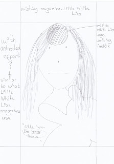
Now my teaser trailer: "Home" and poster is complete, last but not least, we are making a magazine cover for it. I have a few ideas in mind of what I would like my magazine cover to look like. Most film magazine covers feature the main character of the upcoming film on the front, they usually have them posing for the camera but looking exactly how they look in the film, maybe with an important prop to relate it to the trailer or poster. For my magazine cover I wanted to have a close up of Lily Hewitt, who plays the main character, Evie Becks. I think that a close up of her looking at the camera and posing in character will be really effective and create the same sort of emotion that I feel I created in the teaser trailer and the poster. I also wanted to include the teddy bear again, because I think that it's an important prop and represents her childhood and vulnerability. It again connects with the trailer and the poster. Here is a rough sketch of some ideas for my magazine cover:

Monday, 6 December 2010
Subscribe to:
Comments (Atom)
