Monday, 13 December 2010

Designing and editing my magazine cover
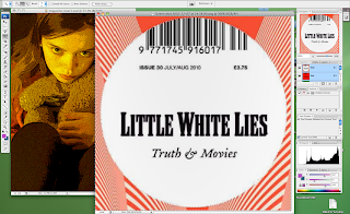
Now I have finished editing my magazine cover for "Home". There are a few things I wanted to analyse from the designing and editing process. After elaborating my ideas I designed the ideal magazine cover that I wanted for "Home". I decided on going with the idea of a close up of the girl with her teddy bear and the "Little White Lies" logo at the top. I took many different pictures so I had a variety to choose from whilst editing. The one that I chose had her looking at the camera whilst she was hugging her teddy bear. By using the teddy bear again it created synergy between my three pieces of work, this helps audiences relate each thing and remember the film. After uploading the pictures on to the computer, I opened Photoshop and there the editing begun! Now I know my way around Photoshop, I found it a bit easier to edit the magazine cover. Here is a snap shot of my poster whilst I was editing it in Photoshop:


I started off by cropping the image to make it portrait. When I took my picture it was landscape, and magazine covers are usually portrait, so I cropped my magazine cover, it also made it look more real. Then I played around with all the different effects that Photoshop has. I wanted to find an effect that was similar to the effects that the "Little White Lies" magazine covers use. So I chose an effect called: "poster edges" that made my picture look animated and stayed true to the design of the magazine cover. I then played around with the lighting and adjusted it so that around her was quite dark but her face and the teddy bear was lighter, I did those so she would stand out.

After, I went on to google images and found the "Little White Lies" film magazine cover logo, then I did a print screen of it and opened it in Photoshop. Following, I used the selection tool and selected only the "Little White Lies" logo, then I right clicked the selection; copied; and then pasted it on top of the other image of the girl. This then gave me the logo as a layer on top of my magazine cover and allowed me to move it around a resize it to what I wanted. All of the "Little White Lies" logos are placed at the top of the cover and in the middle, usually on top of the head of the character (if there is one), so I stuck to this and did the same for my magazine cover. Although, I had a bit of trouble during this process because the logo covered a bit too much of her head, so I had to adjust the image and move it down so the logo covered the right amount of her head. To finish of the logo of "Little White Lies", I then changed the date to 2011, so it looked and felt more realistic.

Finally, I added the title of the film. Most of the "Little White Lies" magazine covers have the name of the film and then "issue" after it. For example: "The Where The Wild Things Are Issue" or "The An Education Issue". So following this, I had on my magazine cover: "The Home Issue". I had it in the colour white because I thought that it looked better because it matched with the "Little White Lies" logo. It also helped it stand out, but I wanted the word "Home" to stand out more because its the title of the film. Therefore, I used an effect called "outer glow" on the word: "Home" to emphasise and draw attention to it. I also used the same font that I used for the poster and the trailer, again; I felt that this created synergy and connected the three together for the audience.

Shooting session for magazine cover

Here is the picture that I chose for my magazine cover:


I chose this picture because I like the way that she is holding on to teddy bear, it shows her vulnerability and how young she is. I also like the way that she's looking and posing for the camera but in costume of her character, this is what most magazine covers do. It lets the audience feel involved with the film, they feel like the actor is looking at them and advertising is targeted at them.

Here are some other pictures that I took during the shooting session for my magazine cover, I wanted a choice of different pictures so I had flexibility whilst editing:


In the first picture, I had the girl looking at the camera with her teddy bear and her bag, two things from the teaser trailer and the poster. But I didn't feel that it worked for my magazine cover. I think that it looked far too similar to my poster and therefore I decided not to use it, I wanted something that had synergy to the poster and the trailer but that was also individual and had its own design.

In the second picture, I had the girl with her teddy bear from a side angle, this is similar to the picture that I chose for my magazine cover. I tried it from a few different angles and I liked them all but I felt that the one I chose looked best and fitted better with "Little White Lies"

Finally, in the third picture, I had a similar position to the first picture: the girl with her teddy bear and bag, outside her front door. But she wasn't looking at the camera for this one and so I felt that it didn't look like a magazine cover. Also, I feel that it didn't feel professional and real enough for "Little White Lies".

Overall, I feel that our final shooting session for "Home" went really well, I was really pleased with the pictures that I took. I am glad that I experimented with different shots and angles, it gave the opportunity to play around with lots of different effects and covers whilst editing.

Influences for my magazine cover
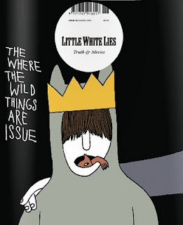
The difference between the poster and the magazine cover is that the poster shows what the film is going to be like and gives away its genre so audiences know what to expect. Then a magazine cover usually shows the main character of the film in costume but deliberately posing and looking at the camera, then inside the magazine there are usually shots from the film, interviews with the characters, etc.

Although, there are some similarities between the poster and the magazine cover. Therefore, when designing my magazine cover, it was quite a smooth process as I had my poster to influence me, as well as my teaser trailer.

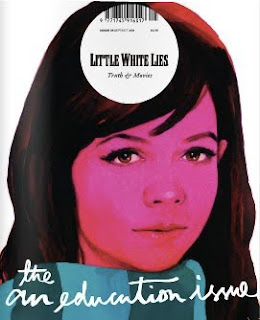
The idea for the front of my magazine cover is a close up of the young girl with the teddy bear, so I wanted to use an existing film magazine that would fit with my idea. At first I considered creating my own magazine, but I struggled on thinking of a good name and design for it, I couldn't find anything that sounded believable and fitted with "Home". So I looked at a few existing film magazines to try and find and some influences and then decided which one I wanted to use. I looked at magazines such as "Empire", "Entertainment" and "Total Film". But the majority of them seemed to be advertising big blockbuster films, specifically action, and I felt that my film "Home" didn't fit with this because it's a family drama about a young girl. Then I came across the film magazine: "Little White Lies". I really liked this film magazine cover because all of their covers featured a close up of the main character of the film, and this is what I wanted to do. It also advertised a wide variety of different genre films, so I thought that this would be good to advertise my drama film. I also liked the way that each front cover of "Little White Lies" was slightly surreal, the faces are kind of animated, I really like this effect because I think that it stands out from other magazines and captures the audiences eye. Here are a few examples of some of "Little White Lies" film magazine covers:


Thursday, 9 December 2010

Ideas for my magazine cover
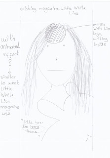
Now my teaser trailer: "Home" and poster is complete, last but not least, we are making a magazine cover for it. I have a few ideas in mind of what I would like my magazine cover to look like. Most film magazine covers feature the main character of the upcoming film on the front, they usually have them posing for the camera but looking exactly how they look in the film, maybe with an important prop to relate it to the trailer or poster. For my magazine cover I wanted to have a close up of Lily Hewitt, who plays the main character, Evie Becks. I think that a close up of her looking at the camera and posing in character will be really effective and create the same sort of emotion that I feel I created in the teaser trailer and the poster. I also wanted to include the teddy bear again, because I think that it's an important prop and represents her childhood and vulnerability. It again connects with the trailer and the poster. Here is a rough sketch of some ideas for my magazine cover:

Tuesday, 30 November 2010

Designing and editing my poster
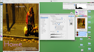
Now I have finished editing my poster for "Home". There are a few things I wanted to analyse from the designing and editing process. After elaborating my ideas I designed the ideal poster that I wanted for "Home". I decided on going with the idea of the girl positioned at the side of the picture, and having an empty background to emphasize her lonliness. I took many different pictures so I had a variety to choose from whilst editing. The one that I chose had her looking slightly to the side with an expression of sadness and fear, she was holding her bag and her iconic teddy bear that was featured in the trailer, this creates some synergy between the two. After uploading the pictures on to the computer, I opened Photoshop and there the editing begun! At first I found it a challenge to get to grips with Photoshop as I have only used it once briefly before, but after a few days of playing around with the effects it got easier and I began to understand it. Here is a snap shot of my poster whilst I was editing it in Photoshop:


I started off by selecting her so I could put a different effect on her to the background. I wanted to create this effect so I could make her stand out and blur the background slightly. To do this I brought out the colours in her so it drew more attention and I used an effect on the background which allowed me to slightly blur the selected part of the image. Although I blurred the background, it still played a big part in my poster. This is why I left it as blank as I could next to her, so the poster showed her alone in an empty setting and lost in emotion.

Then after editing the photo I started thinking about titles and credits. I wanted to create some more synergy with the trailer and the poster, so I decided to use the same font and colour of the title: "Home". I feel that this connected the two together and became recogniseable for the my potential target audience. Then I added in my tagline in a different colour to differentiate it from the title of the film. Following I added the credits. At the top of the poster I put the name of the actress who plays the main character: Lily Hewitt. I had this in the colour white and faded it slightly. My film doesn't have star power, therefore it focuses on genre, so I didn't want to draw too much attention to the name, but I still wanted to include it.

Finally I added the credits at the bottom of the poster. Most posters have this, it's usually in small print and has a few lines written about who directed the film, who produced the film, who the music was by, etc. Then some of them have the release date included in that text, this is what I chose to do. I liked this idea and when using it in my poster I wrote it in white so it also didn't draw too much attention and then at the end of the text I wrote: "SUMMER 2011" in black so it stands out to the audience, to make them aware of the release date.

Tuesday, 23 November 2010

Shooting session for poster

This is the picture that I chose for my poster:

I chose this picture because I liked the way you can see a slight fear in her eyes and the way that the background is empty, giving the feeling of loneliness. I also liked the slight glow the image gave, I think that it brought it to life.

These are some other pictures I took during the filming session, I was experimenting a few different shots to see which one would fit best to my film:


In the first picture I used flash on my camera and I didn't think that it gave it a good effect. Although I wanted the picture to be dark and empty, with the flash I thought that it looked too dull and simple, so I decided to take some of the pictures without the flash to try and get the right effect. I also didn't use this picture because I wanted her placed at the side of the image, I was just trying lots of different things to have a variety to chose from.

The second picture of the teddy bear was just a test to see how it looked, I had the idea of how I wanted my poster to look pretty clear but I just thought I would take a risk and take a picture of just the teddy bear to see if it was effective, and I found that it wasn't effective enough as I had thought. Although the teddy bear is an important and iconic prop in my film, I didn't think that it was enough to have just that on the poster.

The third picture of the girl in her room with her teddy bear and bag did not go to plan as you can see! This one came out a bit blurry, the others were ok but I wasn't satisfied with how it looked, I didn't think it looked 'real' enough and didn't create the feeling that I wanted for poster.

Overall, this shooting session for my poster went really well. I am glad that I took a variety of different pictures because it gave me the opportunity to experiment with a few of them whilst editing and then decide which one worked best with my film.

Monday, 22 November 2010

Tagline for my poster

I found it quite hard trying to think of a tagline for my poster for "Home". On most film posters there is a tagline which usually sends out a message about the film, but doesn't give much away. So it keeps the audience in suspense and they are intrigued to find out what it's about and what's going to happen. I looked back at my trailer and poster influences for "Home" and got some ideas from there and then created my own tagline. I really liked the tagline for "Precious", it's effective and fits perfectly to the genre of the film. It says: "the longest journey begins with a single step". This message is similar to the message that I want to portray. I was thinking of something like "a journey she'll never forget", but still wasn't too sure if it worked enough as I wanted it to. So I thought of doing something like "behind closed doors, everythings not what it seemed". But I still wasn't too sure whether it worked or not, it didn't quite give the emotion that I wanted and I also wanted to include something that relates directly to the title: "Home". So after careful consideration, I came up with an idea for my tagline: "theres no place like home". I think it fits well and accompanies the trailer. It also leaves the door open for the audience to explore; meaning that it doesn't give too much away and leaves them to wonder what could happen in the film.

Wednesday, 17 November 2010

Influences for my poster


Ideas for my poster

Now my teaser trailer: "Home" is complete, we are currently making a poster for it. I have a few ideas in mind of what I would like my poster to look like. I want it to focus on just the young girl and emphasise her loneliness and sadness. Therefore I thought of doing a picture where the girl is alone on the street, similar to the final scene of my teaser trailer. Maybe having her slightly more to one side of the shot to show the empty street beside her and her alone with just herself and her teddy bear - iconic (important prop used a lot in the trailer to highlight her childhood). Here is a rough sketch of some ideas for my poster:


Thursday, 11 November 2010

In reflection..

Now I have finished my teaser trailer: "Home", there are a few things that I wanted to mention; a few things that I came across during filming my trailer. The first is working with children. Whilst planning and filming my trailer, I had to take in to consideration that my main character is a child. Children have a short attention span and when in high pressured situations they have to have regular breaks to keep them on the ball and focused. So I took a risk by casting a child for the main character in my trailer, but it was a risk that I am proud of as I think it worked really well. I didn't encounter any major problems related to this during filming, but there were a few things that made me realise what its like to work with children in comparison to adults. For example; Lily (who plays Evie Becks in my trailer), is 9 years old, she played the part extremely well and I was really pleased with her performance. But because she is young, there were times whilst we were filming where she couldn't stop laughing and it took her many shots to get in to the role, I suppose this is because she is young and didn't really take the situation that seriously, because for her it was probably quite boring. Also, the filming process took longer than I thought because when filming with a child, she had to have regular breaks because if we went on for too long then she would get distressed, lose interest and not put as much effort in to the scene as before. Although I must say that overall when she got in to the character, she played her really well and fulfilled the expectations that I had of Evie Becks, I am very thankful.

Another thing that I came across was the problem of the weather. For my first shot of the mother and daughter in a home video effect, I wanted it to be outside so it looked bright and happy. But due to the weather, this wasn't possible as it was cold and quite dark. So as an alternative I decided to move inside and create a warm and cosy feeling there. Although it wasn't my first choice; I am still very happy with the way it turned out. It also worked well because there are a few scenes after this shot in the trailer of that same room but the atmosphere has changed; this gives it a contrast from what it was before to what it is now.

Overall, I am pleased with my teaser trailer and I feel that I have achieved my goals and hope to do so in making the poster and magazine cover for "Home".

My teaser trailer: "Home"

Outtakes

Although my film is a serious drama, we still had lots of fun and laughs during filming! Enjoy!

Editing

So the editing stage is finally done and my teaser trailer is complete. I managed to do everything that I wanted to during in editing "Home", the process went really well. I started by importing my footage to iMovie after filming, and first I watched all the shots that I had taken and then I began to rough cut them in the the shots that I wanted. I rough cut them with a few extra seconds either side just incase I needed to change anything or needed more of the shot. And then I put them all in order and watched the trailer back. Then came the stage of cutting down each shot to the exact second that I needed. This took quite a while because I thought that each shot was going to be about 4 seconds, and then I realised that that was too long, so I cut them down to 1, 2 and some 3 seconds. I felt that this fit in better with the pace of my trailer. Then I added the transitions. I used overlaps, fade ins and fade outs to help the trailer flow smoothly. Then I created the music at home and imported it to iTunes and then iMovie and slotted it in the right place for my trailer, I had to make sure that it came in at just the right second so it sound effective and highlighted the emotion. Then finally I created the production company logo and the titles and inserted them in. And my work here is done!


Friday, 5 November 2010

Designing the titles

Designing my title was a longer process than I thought it would be, but interesting at the same time because I learnt a few new things. I wasn't quite sure about having my title just over a black screen, so I considered having it over the top of the final moving image of my trailer and then maybe to move on to a black screen. I got this idea from one of my influences: "Precious". Here is a picture of what this trailer does:


I really liked this idea because I think that it's different and quite nice to have the title over a moving image of the trailer. But whilst editing, I discovered that I couldn't do this on iMovie. So I used another program called LiveType. I had to import the scene that I wanted the title over from iMovie and open it in LiveType, then in there it had lots of different options for titles, so after spending a few lessons playing around with the program and the hundreds of different titles that it had, I finally chose one for my teaser trailer. The font is called Kaileen, its a font that is similar to a childs handwriting, which I thought matched perfectly with my teaser trailer. Here is a picture of the editing process in LiveType:


So once I had finished my title, I saved and imported it in to iMovie and I am pleased to say its gone well! And to carry on from this I am going to have a black screen with: "SUMMER 2011" on it, in the same font and the same colour as the title: "Home". I decided to keep the font and colour because I think that it has given it a nice flow from the final shot of my teaser trailer to when it will be released. I looked at some ideas from various different genre trailers to see how they presented their release date, such as "I Love You, Beth Cooper" and "The Lovely Bones". "I Love You, Beth Cooper" had "SUMMER" at the end of their trailer and "The Lovely Bones" had "DECEMBER". So because it is a teaser trailer I haven't given it a specific date, most teaser trailers are quite open and usually say something similar to the examples that I have looked at. This is usually because the film isn't going to be released for a while yet so they haven't set a date, it's just to raise awareness of the film. And then when the main trailer is released they usually give the audience the exact date. Here are the trailers for "I Love You, Beth Cooper" and "The Lovely Bones", although they are a different genre to mine, I was focusing mainly on how they showed their titles:


Monday, 1 November 2010

A few changes..

Although I organised how everything would be and how it would turn out for my teaser trailer: "Home"; not everything went to plan.. But I suppose this isn't a bad thing, it happens a lot in films. The first thing that I changed was the location of shot 1. Originally, it was going to be in a garden with lots of lighting to give it a happy feel; but when it came to filming, I thought that it just didn't look quite right in the garden, the light wasn't effective enough. So I made the decision to move it inside and I filmed it in the living room, I thought that this looked better because it gave a cosy and homely atmosphere.

Another thing that I changed was removing and adding shots. I removed shot 15, which was a close up of the girl asking her mum whats happening. I filmed this shot during my filming session but when I got to the editing stage, I didn't think that it looked as well as I had planned, so I decided not to use it and add some additional shots instead. I added a shot of the young girl in her room sitting on the floor upset, holding her teddybear. I added this shot because at the time of filming I didn't feel that there were enough shots potraying the emotion that I wanted, so I thought of having this shot of the young girl, which turned out to be successful and I feel that it was effective. Here is the picture of the shot:


I also changed the length of most of the shots. When storyboarding, I planned for most of the quick cut shots to be about 4 seconds, I wanted them to be short to create the effect of a trailer and build up some pace and imagination for the audience. But when I came to editing, I realised that 4 seconds was too long. So I cut most of the shots down to about 2 seconds, after doing this I felt that it fitted in with the pace and ran more smoothly.

And the final small change that I made was moving a few of the shots around. When I put all the shots together and played them back, I felt that a few shots needed to be moved so that it all fitted together properly and acted effectively.

Music ♪♫

As my teaser trailer is a family drama with a sad storyline, when thinking about what music to use, I thought that a sad non-diegetic sound would fit it best. I wanted a sound that was quite smooth at the beggining and then changed its tone a bit to make it sound slightly more dramatic throughout the trailer, to match the fast pace shots that the trailer has at the end. I also looked at some other trailers for drama films to try and get an idea of what they used. Two trailers that I particulary liked the way they used their music was: "Remember Me" and "Million Dollar Baby". "Remember Me" is a drama about a young man with family problems. I like the way that this trailer used its music because it started off quite light and sad and then got more dramatic towards the end. I think that this was really effective and similar to what I wanted to create. "Million Dollar Baby" is also a drama about a distressed boxer teacher who lost his daughter. This film is quite different to mine but I really like the way they did their music in the trailer, it changed throughout the trailer as the emotions got tougher, I think it worked really well. Here are the trailers for "Remember Me" and "Million Dollar Baby":


So, after looking at these trailers, with the help of my dad, I created a sound for my teaser trailer. We used a program called Reason 4.0, it was a really good program that allowed us to play around with all different sounds and put them all together to make the sound that I wanted. We started of with quite a subtle sound, using different piano effects. And then towards the end of the trailer we put in some drum effects and some more piano effects to make it sound more dramatic. Here is a picture of the program whilst we we're editing my music together:


The top half has hundreds of different things that we could play with to create different sounds, and the bottom half is where my track is with the different levels and parts to it that we put in (variations of piano, drums, etc.). Here is the final track the we created:

Monday, 18 October 2010

Choosing a production company name
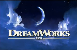
I have finally put together a production company name and logo for my film "Home"! At the beginning of most trailers, there is a short space of a few seconds where the production company's name is shown. As my film is a drama, I wanted quite a subtle and soft production company name, nothing that draws too much attention but still states a point. I looked at some examples and found a few that I really like. These are Dreamworks and Lionsgate:


I like the way that Dreamworks and Lionsgate use clouds as their background and then their production company name in the middle, I think it easily states who the production company is but also is very subtle by having the clouds as the background. So reflecting on these production companies, I decided to create a similar one for my film. I used Photoshop to edit it. I have called it 'Sky Motion Pictures', with a small 'NDP' below it; Niamh Dilworth Productions. I got this idea also from the Dreamworks logo; underneath Dreamworks it says 'SKG', which stands for Steven Spielberg, Jefferey Katzenberg and David Geffen; who are the founders of Dreamworks. Other companies also use this. So I thought about doing this for my production company. Here is a picture of my production company logo:


Monday, 11 October 2010

First cut

Here is the first cut of my teaser trailer, "Home":


This cut is after I had put all the scenes together and worked out how long they need to be and cut them to the exact second that I need. I have also got a sample of the non-diegetic music that I am going to use. I created a quick sample so I could get a feel of how it sounded and if it was the right choice of music for my trailer, and luckily it was! I still have a lot more to do on my trailer. Such as the transitions; which will help the trailer flow from shot to shot and all fit in properly. I also have to create the production company logo, create the titles at the end and then do the final touches on the music track so its fits each shot. There are a few things that I am not quite sure I like at the moment; such as the black screen shot of the arguing, but once I get closer to the end of the editing process I am going to analyse whether to keep it or not. So hopefully soon you will see the full and final trailer on here!

Second filming session

I had my second and final filming session for my teaser trailer "Home" on Friday 8th October 2010. Again, I was very pleased with it. It went really well and I managed to get all the shots plus extras that I needed. The only thing that we found tough was getting in to character for filming. It took one of my actresses a while to stop laughing! But then after a few shots she got in to character and played it very well. In this filming session I filmed shot 1, 3, 6, 9, 10, 11, 13, 14, 16, 17 and 18. It was a very long filming session! I also got quite a few extra shots that are not on my storyboard. I did this because after watching a few examples of different trailers; I found that a lot of them have 1-2 second shots of random objects in the scene/setting. So whilst filming I spontaneously did a few of these shots. I did one of the young girls teddy bear, one of lit candle and one of some colourful flowers. I also did this so whilst editing I had a variety of shots to chose from and see whether they fit in with my trailer or not, hopefully some of them will be successful. I also found my storyboard very useful in this filming session, again it helped me plan and schedule what shots I needed and how long it would take.

Wednesday, 6 October 2010

First filming session
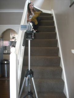
Filming has now begun! I've had my first filming session of my teaser trailer: "Home". I feel that it was very successful and I managed to get the shots that I wanted. I found that my storyboard helped me a lot through filming because it gave me an idea of what shots I need to film and roughly how they need to look, without the storyboard it would've been harder to film as I would of had to quickly try and think of the shots there and then. In this filming session I filmed shot 4, 5, 7, 8, 12 and 15 from my storyboard. I filmed each of these shots two or more times, I did this just incase one of the shots went wrong, so I had a backup. I also filmed a few of the shots from two different angles, so whilst editing I have a variety of shots to choose from, to see which one fits best with my teaser trailer. Here are some photos of whilst I was setting up the camera and starting to film.


Thursday, 30 September 2010

Casting shots

I have three actors for my teaser trailer; "Home". The main character is the young girl; Evie Becks, played by Lily Hewitt. I chose her because she is very good at acting and has experience in acting even though she is young, so I thought that she would be perfect for the role of Evie. She fitted the image that I wanted to create of a young and vulnerable girl. My other two characters are Nicola Becks, played by Emma Hewitt and Tom Strade, played by Conor Hewitt. Nicola is Evies mum. I chose Nicola because she is a versatile actress who can change from one different thing to another very easily, and this is similar to what her character does. Because at the beginning, Nicola is a happy and kind mum, but then when she meets Tom he changes her and she begins not to care about her daughter or herself anymore. And I chose Tom because he is very tall and looks the part of a villian (don't tell him I said that!). I felt that he would live up to the role of Tom that I had created.

I am very grateful for all the work that my actors have done, they have made my idea come to life in every possible aspect, thank you.

This is Lily Hewitt, who plays Evie Becks:


This is Emma Hewitt, who plays Nicola Becks:


This is Conor Hewitt, who plays Tom Strade:

Location shots

Here are some location shots of where I am going to film my teaser trailer:


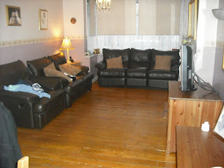
Choosing a location wasn't as hard as I thought it would be. This is because my film is filmed in an average family household, so I just chose a house that I thought would work with my idea. The first picture is the house where I filmed the whole of my teaser trailer, inside and out. Then the next picture is of the living room where I filmed the first shot of the video camera effect and a few other shots throughout the trailer. The next picture is of the road where I filmed the outside shots of the girl running and of her on her own in the last shot. The next picture is of the girls bedroom where I filmed a few shots of her upset and packing her bags. Then the final picture is of the first shot of the trailer where the sad, non-diegetic music begins.

Choosing a title

Choosing a title for my film was much harder than I thought! It is crucial that the title of a film sounds right and not too 'cheesy', and that it doesn't give everything away. I was going to call my film "Runaway", but then I thought that it would give away the story line that the young girl runs away from home. So I thought about other names such as "Evie Becks" - the young girls name, and "A Broken Family", but I felt that they didn't sound effective enough and "A Broken Family" sounded too 'cheesy'. I then thought about calling it "Home Sweet Home", but it still didn't sound right. So I decided to call it just "Home", although its only one word, it portrays the right message for my film. It gives the audience an idea about a family home but also leaves it open for thought about how things aren't as they seem behind closed doors.

Wednesday, 29 September 2010

Film schedule
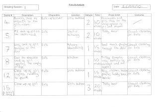

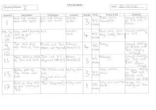
Here is the film schedule for my teaser trailer: "Home". This will help me prepare for each shot that I am going to film, what characters I need, what props I need and how long it will take. It will help me organise each filming session and make sure that I have everything I need to get the right shots for my teaser trailer.

Storyboard
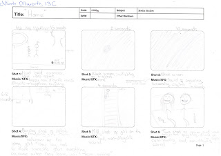


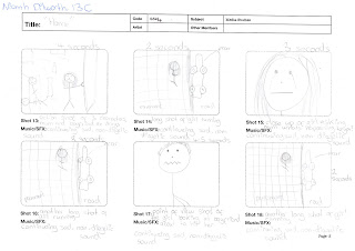
Here is my storyboard for my teaser trailer: "Home". I am not a very good drawer so I have tried my best to explain how I want my teaser trailer to look through stickmen! There are a few shots on my storyboard such as shot 2 and 3 that I won't be able to decide how they look until the editing stage, once I get to that stage I am going to try it out and see if they fit in with the other shots. Also for shots 14, 16 and 18 I will not know how they will look until the editing stage, because I am going to film the same shot of the young girl running from different angles and then cut from them between the last few shots, I hope that this can look effective and create the feeling that I hope to create. Once I have filmed all the shots on my storyboard, I might film a few extra shots of some ideas that I'm still not too sure about. If I do this then it will give me more shots to chose from whilst editing and allow me see which one looks best.

Wednesday, 22 September 2010

Target audience

Tuesday, 21 September 2010

Synopsis

The plot for my film is a story of a young girl who thought she had everything and was as happy as ever, living with her mum at home. But then her family began to change and fall apart when her mum met a new man and strangely fell in love with him, even though he was a drug addict and verbally and physically abused her family. My film follows the story of Evie Becks - the young girl and how she can't take how things are at home anymore, so she decides to runaway to try and stand on her own two feet, at just the age off 11. Its killing her inside, but its something that she has to do.

Wednesday, 15 September 2010

Influences

The influences that I have for my teaser trailer are "Precious", "My Sister's Keeper" and "Hostel 2". They are 3 very different films, but each of them have aspects that really interested me and inspired me with ideas for my teaser trailer.

Starting with "Precious". "Precious" is a drama made in 2009 about a teenage girl who is pregnant with her second child, gets abused by her mother and can't find happiness. Its a very sad story. It was the genre of this trailer that influenced me, it was really powerful and completely captured me. It has a similar story to my teaser trailer in the way that it follows the journey of a young girl with family problems and trying to find a way to cope, although its killing her inside. I also want my trailer to feel as powerful as "Precious" felt, by delivering the genre correctly and capturing peoples emotions. Here is the trailer for "Precious":


Next is "My Sister's Keeper". "My Sister's Keeper" is a drama made in 2009 about a close family where the parents conceived their youngest daughter to save their eldest daughters life, who has cancer and is dying. The film follows each character and how they are coping with whats happening to their family and the girls illness. Its also a very sad story. It was the structure of this trailer that influenced me, it was really well put together and it really interested me how it changed the feeling of the film in a short space of time, by having happy and light scenes in slow motion and then having dark and sad scenes. This is an effect that I want to create in my teaser trailer. Here is the trailer for "My Sister's Keeper":


Finally its "Hostel 2"."Hostel 2" is a horror film made in 2007 about 4 students who go to stay in a Hostel together thinking that they're going to have a great holiday but what they don't know is that the people in the Hostel like to torture, rape and kill whoever comes in. Although this trailer is completely different to my idea, it was the microaspects that influenced me. The way that the camera had different shots of objects that signified the genre of the film. I thought that this was really effective, because it told the audience a bit about the film but without giving it away. I would like to use this idea in my teaser trailer, by maybe having some shots of things to signify the young girl. It also influenced me by the way that the end of the trailer has noise on a black screen. I would also like to use this idea by having a black screen with the noise of argueing, I think that this would be really effective because sometimes hearing the drama but not seeing it makes it sound more serious. Here is the teaser trailer for "Hostel 2":


Tuesday, 14 September 2010

Initial Ideas

At first I considered following the action/thriller genre and doing a film similar to "The Lovely Bones" and "Man On Fire", a story about a young girl gone missing. But then I had a change of mind as I thought that attempting to film an action film like this would be extremely difficult in terms of setting and props. So I thought about the different genres that I could do and I settled with drama. My idea is a family drama based on a young girl who thought she had everything and was as happy as ever, and then her mum began to change and her family was never the same again. A film following her story of how she couldn't take it anymore, her life changed and she had to learn to look after herself, at just the age of 11.

I chose this genre because its my favourite genre, and I wanted to do something that I feel passionate about. I also like emotional films and I want to portray the emotions that other dramas do in my teaser trailer. I think it will be very interesting to film this idea and put it all together to become an effective teaser trailer.

The characters that I have in mind for my teaser trailer are Evie Becks - the young girl, Nicola Becks - the mum of Evie and Tom Strade - Nicolas new boyfriend.

What is a teaser trailer?

In class we watched five examples of teaser trailers. Each one of them were different, this gave us an overview of some of the things that we can use for our teaser trailer.

The first one was "Inception":


The teaser trailer for this film had no dialogue in it, it was all based on action and building suspense with the non diegetic sound. It showed lots of shots of objects and people with strange things happening to them, this got the audience wondering what was going on, got them thinking and wanting to know more. It emphasised its names and titles a lot, this may have been to highlight the stars in the film, which created star power. Also to highlight the fact that it was from the same director of another successful film: The Dark Knight. Many teaser trailers don't have dialogue in them; its a great way to tease the audience about a new upcoming film and creates awareness that the film is being released soon.

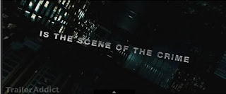
I thought that this trailer of Inception was very well put together and made me want to watch the film and know more. I especially liked the words that came up explaining parts of the film and giving a clue to what it may be about. This inspired me and gave me an idea for my practical production. Because once I have the full plan of my teaser trailer, I want to use words coming up on screen to give the audience a feel of what could happen:

The second teaser trailer that we watched was "Cemetery Junction":


This teaser trailer was very different to others, it had absoloutely no scenes from the film in it. Instead it had the directors and one of the actors talking to the camera, behind a white background. It was a big risk for them to do this because the audience may have seen it and not taken much notice of it because didn't include any clips or pictures from the film. But it may have also worked for some people who are fans of those directors and actors, it may have interested them in wondering what the film was going to be like with these people directing it.

Personally, in my teaser trailer I don't want to take this risk because i'm relying on genre more than star power; and Cemetery Junctions trailer had the benefits of star power.

The third teaser trailer that we watched was "Eternal Sunshine of The Spotless Mind":


This teaser trailer had quite a lot of dialogue in it but still managed not to give a lot away. Because there were lots of weird stuff happening such as a bed on a beach, and a shrunken man, etc. This confused the audience in to thinking what was happening and got them entrigued to know more. This is similar to the first teaser trailer that we watched: Inception. Eternal Sunshine of The Spotless Mind had a non diegetic sound and layout that was quite up beat and funky, which suggested that the genre may be a light comedy. It also captured the audience by drawing attention to the titles. It showed about six very famous actors names, this gave the it star power. This is also similar to the way that Inception drew attention to their titles and gained star power for their teaser trailer.

The fourth teaser trailer that we watched was "Paranormal Activity":


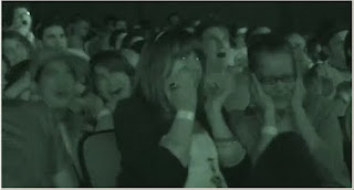
This teaser trailer was also quite different to usual teaser trailers. It showed a large audience that was the first audience to watch Paranormal Activity. It showed them in the cinema and filmed their reaction. I think that this teaser trailer was really well done by the way that it focused a lot on its genre, because it was a low budget film and didn't have any star power, so by focusing on its horror genre it attracted a very large audience and was highly successful. By having this audience in the teaser trailer, it showed how scary the film is and made people want to come and experience it. They also had quotes from film critics to emphasise how scary this film is.

The fifth teaser trailer that we watched was "Live Free or Die Hard":


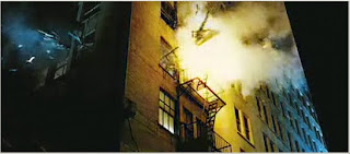
This teaser trailer contained a lot of action and hardly any dialogue, again; similar to Inception. Live Free or Die Hard used interesting shots of cities in black and white changing in to colour, and then lots of violence and action happening. For the first part of the shots of the city, it was quite quiet and slow, and then the words came up "Live Free", and then in the second part it was quite loud and fast, and the words came up "or Die Hard". I think that this was a good way of showing the title because it linked it to what was happening in the film. I think that the action that this teaser trailer used was very effective, because it was dramatic, loud and with lots of explosions, and films like this usually attract a wide audience because they like to see a lot of drama and action on screen. It also had some star power, which it used in the middle of the teaser trailer and at the end. In the middle some of the titles came up with various famous actors and the last shot was of those actors. This made the audience interested in seeing a big action film with these actors in it.